
Atlanta Preservation Center
Branding | Editorial Design
The Atlanta Preservation Center is an organization that promotes the preservation of Atlanta’s architecturally, historically, and culturally significant buildings, neighborhoods, and landscapes through education and advocacy.
They approached us for a rebrand, that could reach a newer and more contemporary audience without alienating the current supporters, who tend to be older. To bridge this gap, we kept the branding grounded in the organization's history while introducing modern elements that appeal to a younger generation focused on urban preservation.
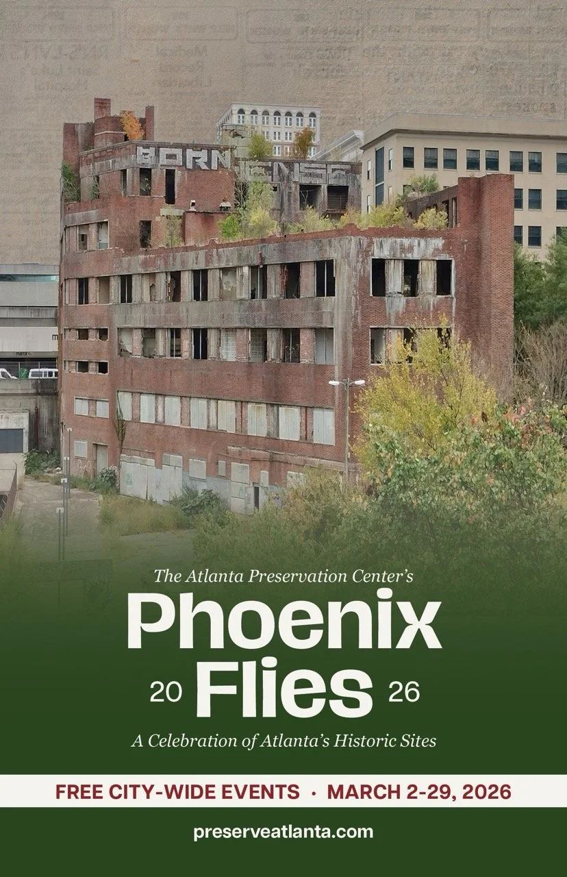
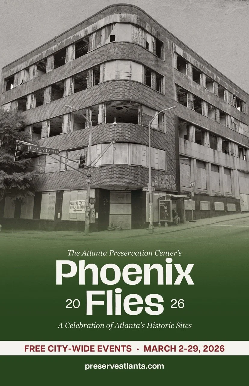
A big part of this was rebranding "Phoenix Flies," their yearly celebration of Atlanta’s historic sites. I led this effort by creating the branding, the 2026 book spreads, the cover, and the poster advertisements. I focused on making the layouts feel fresh and accessible to a younger demographic, while ensuring the typography and content remained clear and respectful for the established audience.
Previous Branding

Old logos for APC and Phoenix Flies.
Atlanta Preservation Center Rebranding
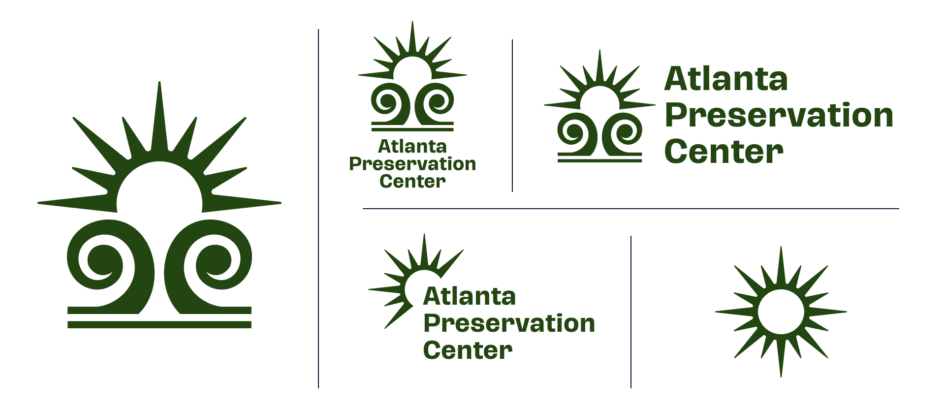
Logos and variations for APC.
Phoenix Flies Rebranding

Logos and variations for Phoenix Flies.
Phoenix Flies Book (2026)
Book focusing on the Atlanta Journal Constitution Building and other monuments.
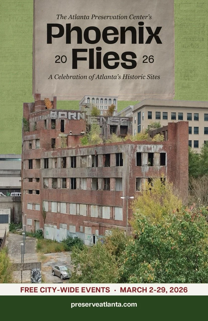
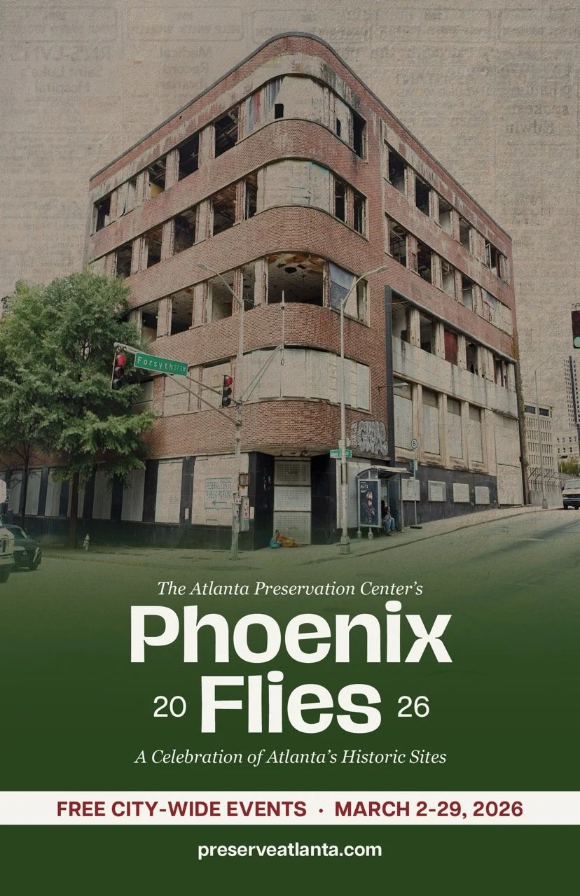
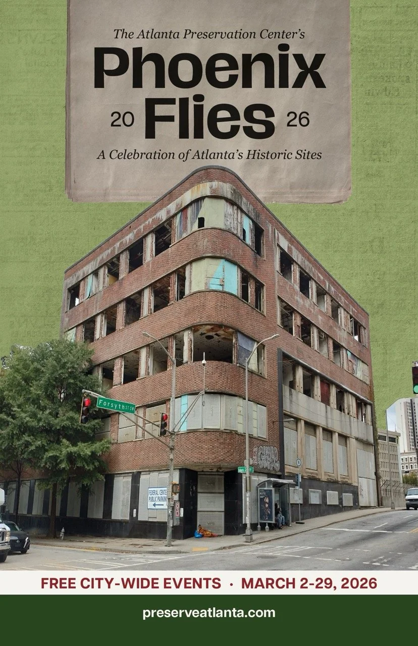
Cover Variations
Stationary Design
Business cards, pamphlets, and letterheads.
Merchandise
Tote bags and a cool hat.
Social Media Content
Informative carousels for Instagram.